When defining the layout of my magazine, I first conducted further research in the layout of other traveling magazines and saw that they all mainly communicate with their readers through the use of imagery. But what I noticed is that there are two types:
Those magazines that display lots of pictures in small sizes. Like the one Above
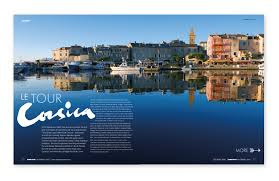
And those that display just a couple of large ones which usually take big portions of the whole layout...if not all.
When designing my two page spread layout, I not only took into consideration my target audience. But also the fact that the magazines that go for the “small sized pictures” usually look very crammed and cause in the viewer an overwhelming sensation. Obviously I didn’t want that so I went for the “large-single picture” format.
On my next post I’ll show you guys my COMPLETE FINAL PRODUCT. So stay tuned!!!


No comments:
Post a Comment