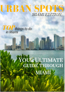
Initially, last week I posted a sample I designed with Canva, of my cover page layout showing which cover lines I was going to use, and how the masthead font and the general composition of the cover was going to look like. This is my cover after just incorporating the picture I took, the Masthead, and one cover line I designed at the moment.
Still, I decided to make some changes to the font of the Masthead, because, based on the traveling magazine conventions traveling magazines go for a formal, thin, pointy font. And somehow I felt that the one I used before was very bold and round and gave viewers the first impression of a sports magazine (based on a survey I did, plus my classmates opinion).
 |
| Cover, after changing Masthead's font and incorporating the other cover line |
Now I was deciding between a mustard yellow colored font, or a coral red. Finally after asking many people and judging by what I thought would be more effective at catching the viewer's attention, I went for the Coral Red. The reason behind it was because I wanted to create contrast with the landscape being displayed and the yellow wasn’t really efficient at that, or at visually capturing the attention. In relation to the cover lines, I decided to display few coverlines in order to keep the image neat and as the main focus, while still maintaining the same font and style. So now I have it TA DA!!! My magazine cover.
 |
| Final cover!!! |

No comments:
Post a Comment