Here is my Creative Critical Reflection, enjoy!!!
Clementina's AS Final Project
Sunday, April 9, 2017
Saturday, April 8, 2017
Defining Two page spread
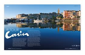
When defining the layout of my magazine, I first conducted further research in the layout of other traveling magazines and saw that they all mainly communicate with their readers through the use of imagery. But what I noticed is that there are two types:
Those magazines that display lots of pictures in small sizes. Like the one Above
And those that display just a couple of large ones which usually take big portions of the whole layout...if not all.
When designing my two page spread layout, I not only took into consideration my target audience. But also the fact that the magazines that go for the “small sized pictures” usually look very crammed and cause in the viewer an overwhelming sensation. Obviously I didn’t want that so I went for the “large-single picture” format.
On my next post I’ll show you guys my COMPLETE FINAL PRODUCT. So stay tuned!!!
Friday, April 7, 2017
Defining Table of Contents
I here are my two options for my table of content:
 |
| Option 1 Option 2 |
They are pretty similar, in terms that they display the content in visual way, not relying so much in text. But what varies is the arrangement of the images. Personally, I like a lot the one on the right because the order seems more dynamic, and the arrows aren’t jumping all around. But, that is just me personally. Both of them are perfectly fine because they follow along with the visual presentation of content. So, I might end up going for the one on the right.
Lastly, let me just clarify that my TOC just displays the featured article of my magazine. A lot of my classmates have suggested to incorporate the label of "featured" somewhere beneath the title of Contents. But I will first have to discuss it with my partners and then see.
PS: the are just a rough draft, as you can see there are a couple missing the images and the correct names. and the numbers are all messed up.
Thursday, April 6, 2017
Defining Cover!!!
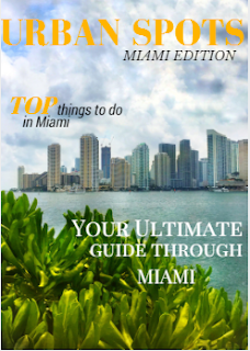
Initially, last week I posted a sample I designed with Canva, of my cover page layout showing which cover lines I was going to use, and how the masthead font and the general composition of the cover was going to look like. This is my cover after just incorporating the picture I took, the Masthead, and one cover line I designed at the moment.
Still, I decided to make some changes to the font of the Masthead, because, based on the traveling magazine conventions traveling magazines go for a formal, thin, pointy font. And somehow I felt that the one I used before was very bold and round and gave viewers the first impression of a sports magazine (based on a survey I did, plus my classmates opinion).
 |
| Cover, after changing Masthead's font and incorporating the other cover line |
Now I was deciding between a mustard yellow colored font, or a coral red. Finally after asking many people and judging by what I thought would be more effective at catching the viewer's attention, I went for the Coral Red. The reason behind it was because I wanted to create contrast with the landscape being displayed and the yellow wasn’t really efficient at that, or at visually capturing the attention. In relation to the cover lines, I decided to display few coverlines in order to keep the image neat and as the main focus, while still maintaining the same font and style. So now I have it TA DA!!! My magazine cover.
 |
| Final cover!!! |
Wednesday, April 5, 2017
Meet the savior
On my last day taking pictures in Miami. I went to Dodge Island, from where i was going to capture Miami's epic skyline which I intended to put as the cover image of my magazine. This was a critical task, which needed to be done RIGHT. "A picture is worth a thousand words." The cover image of a magazine is one of the most important ,if not the most important, component of the whole cover. It's plays a crucial role in drawing the readers attention, and ultimately making them want to consume our product.
The night before going to Dodge island, I checked the weather and there was 20-30% chance of rainfall late in the afternoon. Therefore I decided to go early in the morning. Although it said "late afternoon" there I was, 10:30 am, and there was a big black cloud blocking the sun light and coloring the scenic view with a grey hue.
This situation was completely out of hands and there was nothing I could do to modify it. Still I carried on with my task, just in case there was something I could do. Later that week I decided to talk to a fellow classmate (Vanessa Chiquito) about my issues with the pictures and she suggested me an editing app called Snapseed.
Snapseed has been my savior, my guardian angel, my real "mvp", however you want to call it. This app LEGIT saved my day. And as a proof I'll show you the following picture, which I am using as my cover image.
The picture in the left is the one I originally took. As you can see the image is completely impregnated with a grey hue. While the image on the right ,which I edited with Snapseed, displays the proper lighting. I must confess, that at the beginning I was daunted by the idea of editing, but the app resulted to be really easy to use and manage, in order to come with the your ideal picture. And trust me when I say it's super easy to navigate through. I am the least "tech savy" person.
Not only did I use this app to edit the cover image, but I'm also using it to enhance the colors of my other images.
Catch me up in my next post!
Not only did I use this app to edit the cover image, but I'm also using it to enhance the colors of my other images.
Catch me up in my next post!
Tuesday, April 4, 2017
CVI CHE 105
After leaving Brickell City Centre, my mom and I were really hungry so we proceeded to move to our
next stop. CVI CHE 105. Before selecting which restaurant I was going to pick for my “Trending Restaurant” section, I conducted an extended research on this restaurant which particularly catched my attention.
During the second week of this project, I researched on local restaurants that 1) had a prestigious reputation, worthy of the title “Trending restaurant” and 2) and most importantly take into consideration the type of prices the restaurant assess so that they appeal to our target audience (couples with an annual income of $60,000 to $97,170). But one thing I was sure of, I wanted to choose a restaurant that accurately represented Miami’s cultural heritage. The choices I presented during the second week followed along with the two requirements, but they failed at representing Miami’s diverse heritage.Therefore, I engaged in a more in depth research that lead me to CVI CHE 105.
CVI CHE 105, is a restaurant that will completely transport you to the back to the Incan era. With its beautifully decorated lounge, ropes hanging from the ceiling and vertical garden walls, delightfully contrast with the Peruvian tapestry of the cushions. This superb traditional Peruvian cuisine restaurant has become one of Miami’s most popular culinary hotspots in the past recent years. Mainly attracting clients for their famous ceviches. This ceviches has granted the restaurant the award of Best Ceviche for 5 consecutive years. And award hosted by Miami New Time Readers Choice. In addition to this award, CVI CHE 105 has been honored with Best Restaurant Downtown Miami, Top 15 Mami by Zagat Survey 2015, Best Peruvian Restaurant Miami, and Top 5 Trendiest Restaurants Miami 2015.
 |
| The plate I ordered was Fuente Pacifico |
"CVI.CHE 105 Downtown Miami by Juan Chipoco." CVICHE 105 Downtown Miami. N.p., n.d. Web. 4 Apr. 2017.
Subscribe to:
Comments (Atom)


